TodayTix is expanding the world of live theater through a modern approach to discovering shows and purchasing tickets. I worked with the Product team to carry out usability tests and design explorations for the updated website.
Product Design Intern
WHY
Finding the best entertainment in town isn’t easy. Important event details and fair ticket pricing are typically scattered across multiple sources, and especially for those unfamiliar with theater and arts productions, this can lead to a less than enjoyable experience.
Since 2013, the TodayTix mobile applications have given theater enthusiasts the leading solution for discovering shows and purchasing tickets. Now, the platform's services are being added to the TodayTix website as part of the company’s goal to make the theater world more accessible.
WHAT
Amongst a few smaller roles working alongside Engineering and Marketing, my time as a Product Intern was spent primarily on two tasks — managing usability tests and exploring new feature concepts.
Usability Study - Improving the Website's Checkout Process
After familiarizing myself with the TodayTix platform, I began working on a usability study for the website's newly designed checkout process. I carried out the study over a three week period consisting of design, recruitment, and testing. Following these steps, I analyzed the data into key findings that could improve the conversion rate on ticket purchases.

Exploring New Features - Discover the Best Shows
TodayTix was looking to design a feature (now called Discover) that would broaden ticket sales while also helping users find the best shows matching their interests. I worked alongside our Product VP to draft early concepts and design the feature’s CMS experience.

HOW
My process for each challenge was determined by their distinct problems and goals. With one project focused on research and the other on design, I had to implement my processes differently to reach their respective results.
Usability Study - Finding the Right Data
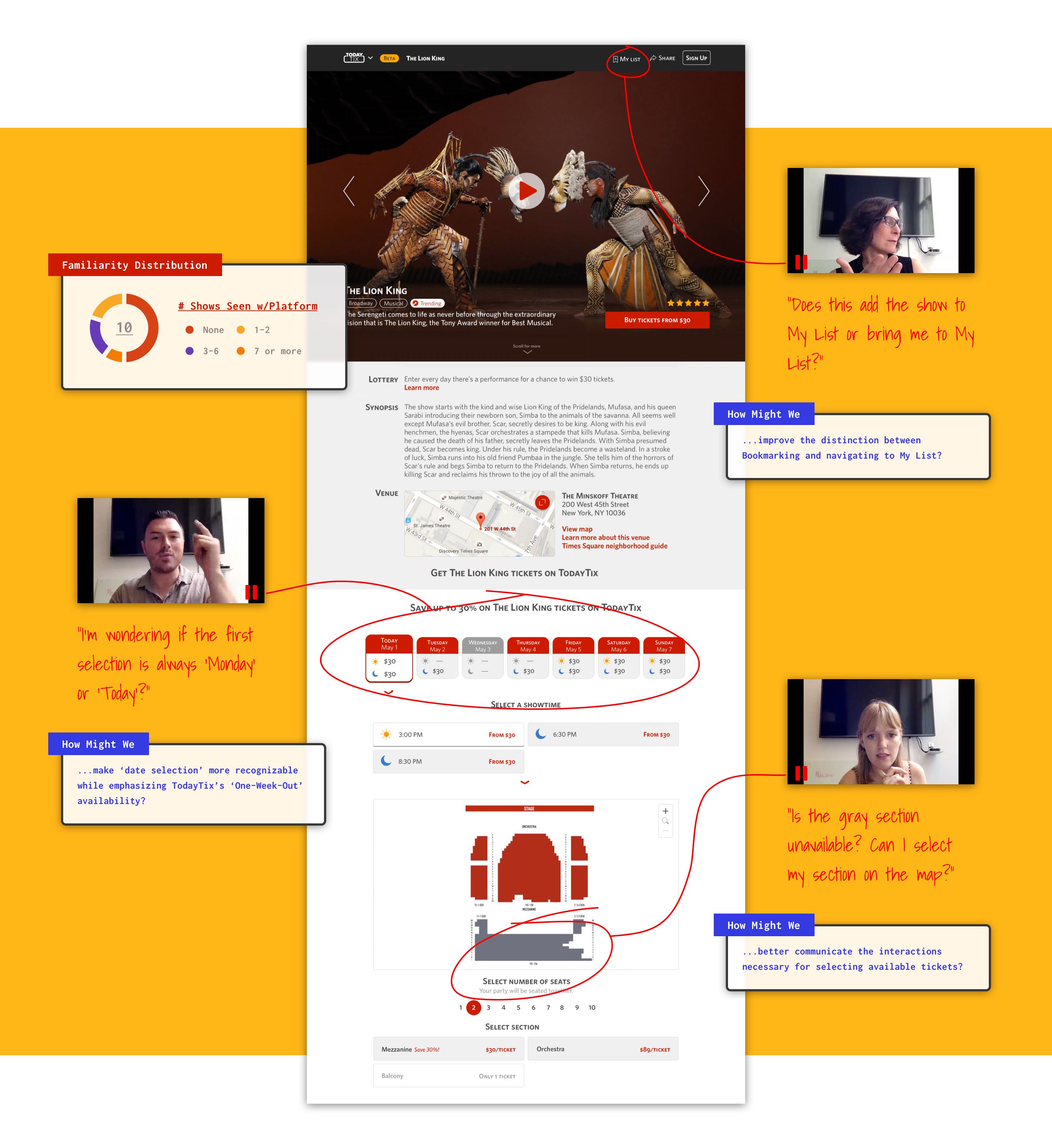
Although similar to the mobile app experience, the Product team still needed to know how the redesign would affect the website’s new checkout system. Would the new visuals make it easier for users to recognize important information while purchasing tickets? We believed a guided usability study would give us the answers.
Using an InVision prototype, I designed the testing sessions to be semi-structured and heavily qualitative with each task focused on the participant’s understanding of the design components. I then carefully created the criteria to implement a Google Survey that would recruit 10 participants matching TodayTix’s intended demographics.
These components not only established the outline for the study, but also ensured that future design decisions would be based on reliable data.
When moderating each session, I used 3 different recording tools to capture data — Lookback, a video camera, and written notes. I transferred the data to sticky notes which were then categorized in an affinity diagram to highlight the successes and problems with the design’s usability.
To wrap up the project, I presented my analysis to the team with actionable insights about the checkout process (“Going forward, how might we…”), and together, we discussed how potential solutions would fit into the scope of the redesign and company objectives.

Exploring New Features - Creating a Foundation
In order to design an effective foundation for a recommendation tool with real data, we acquired further details about our customers’ experiences by sending out a survey with 3 particular questions:
1. What was the occasion for seeing that show?
2. Why did you choose that show in particular?
3. What did you like most about the show?
I then used the survey’s results to build a list of keywords that demonstrated a contextual relationship between the show’s characteristics and the user’s preferences.
By curating shows for users according to similar keywords, my initial Discover concepts explored AI techniques as an effective solution, but ultimately, we recognized that manually curated lists would work best for the scope of the project and would provide valuable insights for future versions of Discover.
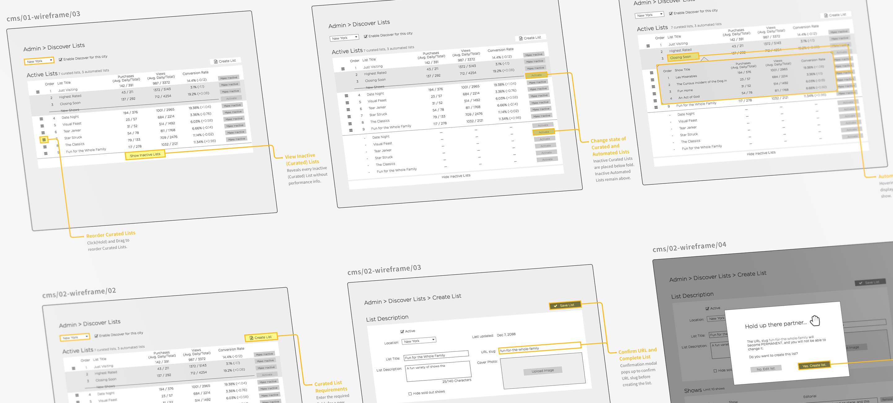
While my manager translated our front-end concepts into higher fidelity designs, I designed the back-end experience for the CMS. Not only did the curated lists need to be presented effectively to the user, but the CMS also needed an efficient layout to monitor the performance of each list. This established a framework for the team to build upon going further.
Although the redesigned website didn't release until after my internship, I gained valuable experiences from supporting the product development cycle for many of the new features now seen at todaytix.com.